UI/UX Redesign for reducing user’s stress Level 🫀

Background
Covid-19 makes a list of needs, especially in digital world. Nowadays, the healthcare industry grows insanely: by the end of 2021 we have more than 350,000 digital health apps available in app stores for smartphone devices.
Imagine a mobile App that prevents the user from discovering diseases too late, and lets him buy insurance that covers personalized care due to any condition. In other words, based on the data you intake to the algorithm, the app tells you the degree of risk of getting a particular disease.
Scary. But the idea is brilliant because at the end of the day, after discovering your highest chances of getting sick, you can easily select and buy insurance personalized for your case.
The Task
As a designer, I was asked to help with rethinking the user interface' of 2 screens for such Application, but without changing a functionality a lot. This usually means that UI elements could be essentially modified, but no significant difference in user behavior is required. However, I decided to suggest some of them. And since the project is a conceptual design, unleashing creativity seemed a lovely way to work. 🤓
Risks, Strategy and Values

The Risk
The most expensive and fragile that human has is health. When it comes to product design, it’s closely intertwined with time and money. User Experience [in this case] is happened to be precisely in the middle of these 3 factors.
The Strategy
In such an essential decision as possible health conditions, it’s crucial to use all the possible tools to calm down the user. So I established the list of rules and followed them through the whole design concept:
1. Be friendly and informative, but not overwhelming
2. Speak simple language, but maintain the borderline of seriousness
3. Explain with graphics as much as possible, but keep the medical orientation
The Value
Respectful UX is something that we desire both as users and designers. So personalized approach plays a leading role in healthcare products in general, its voice and tone, colors, and design elements.
Analysis
Redesigning for just beauty’s sake is not making the product better, but redrawing. However, pretty easy to mess things up when it comes to the pleasure of drawing pixels. I have a checklist for design evaluation to level up the UI but maintain the overall UX simultaneously.
Design Evaluation Checklist:
✅ Consistency: Overall look & feel
✅ Hierarchy: General purpose of the screen and clear CTA(s)
✅ Legibility: Texts are legible and readable
✅ Accessibility: Contrast is high enough
✅ Color palette: Proper usage and relevance
✅ Attitude: Voice & tone
This list helped me easily detect the problems of the given screens. (Zoom in the embedded file or go ahead and read the results in the article)
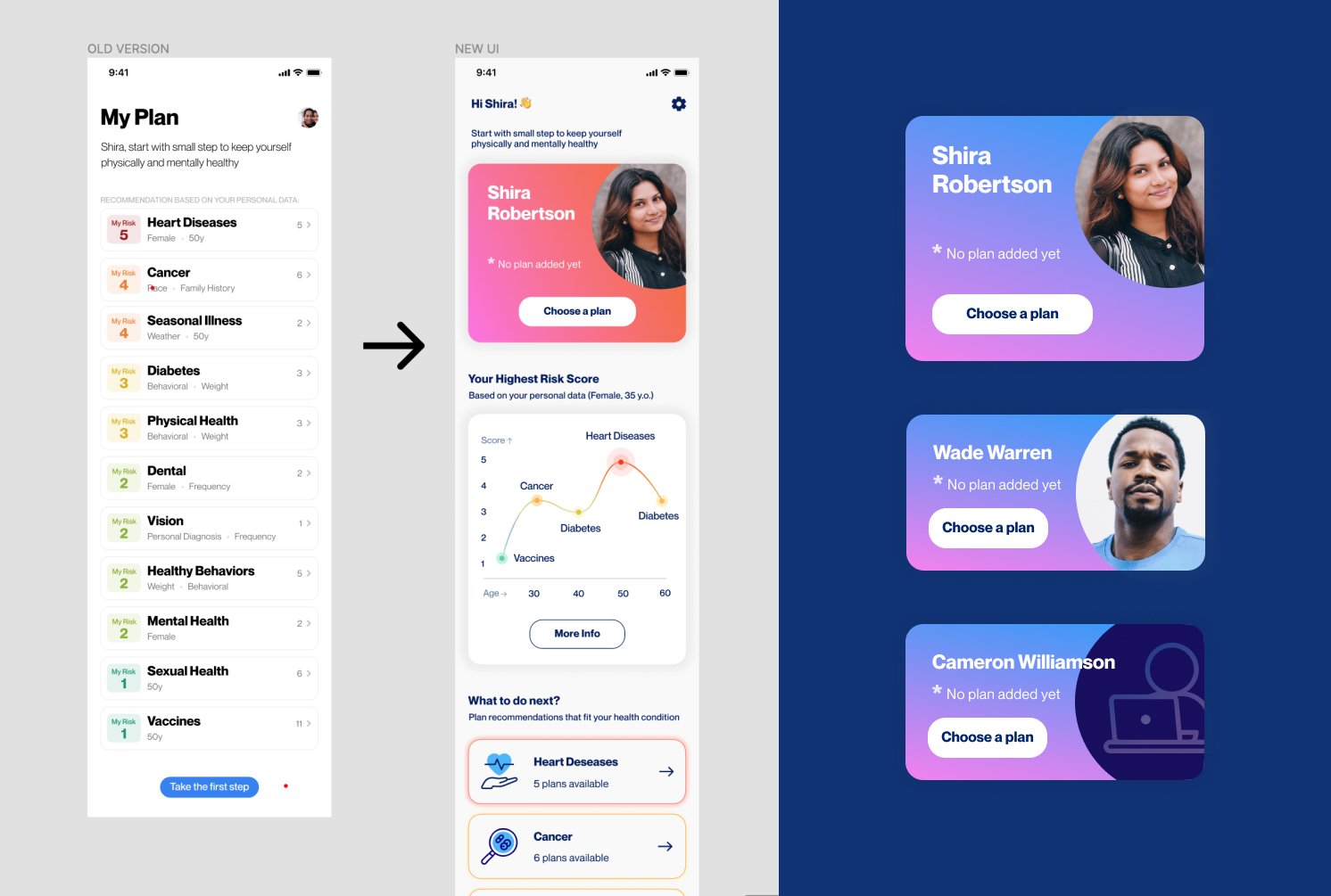
Defined Problems with Current UI:
🔺 Consistency
Different CTAs styles
Second screen is missing the title
🔺 Hierarchy
Conflict between the title and subtitle (My plan VS. Recommendations)
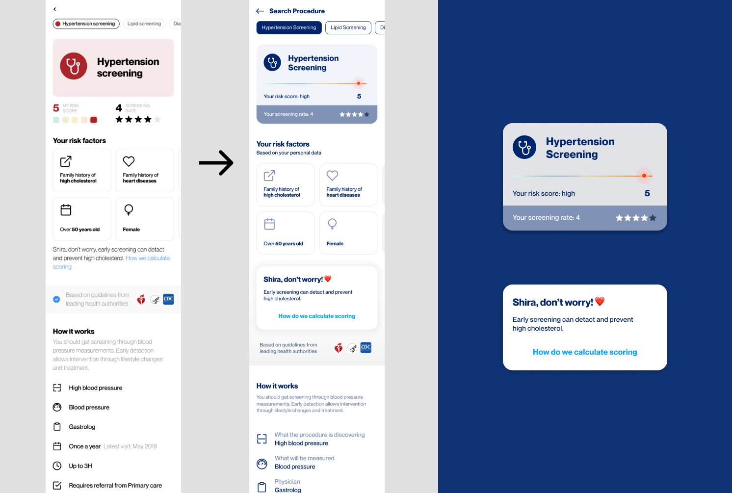
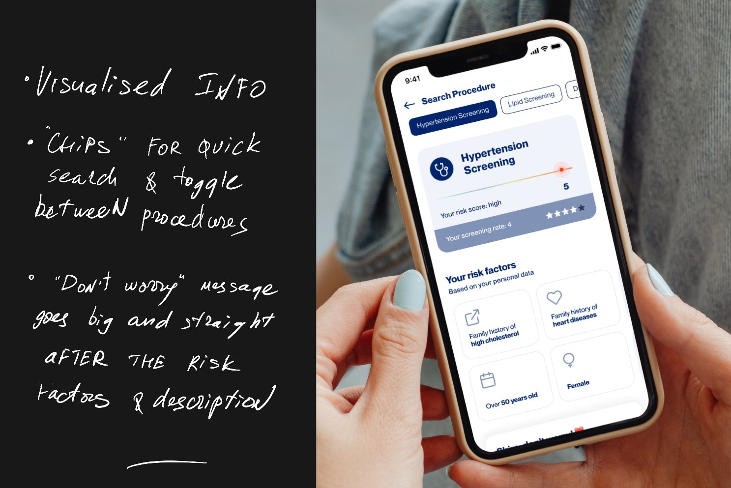
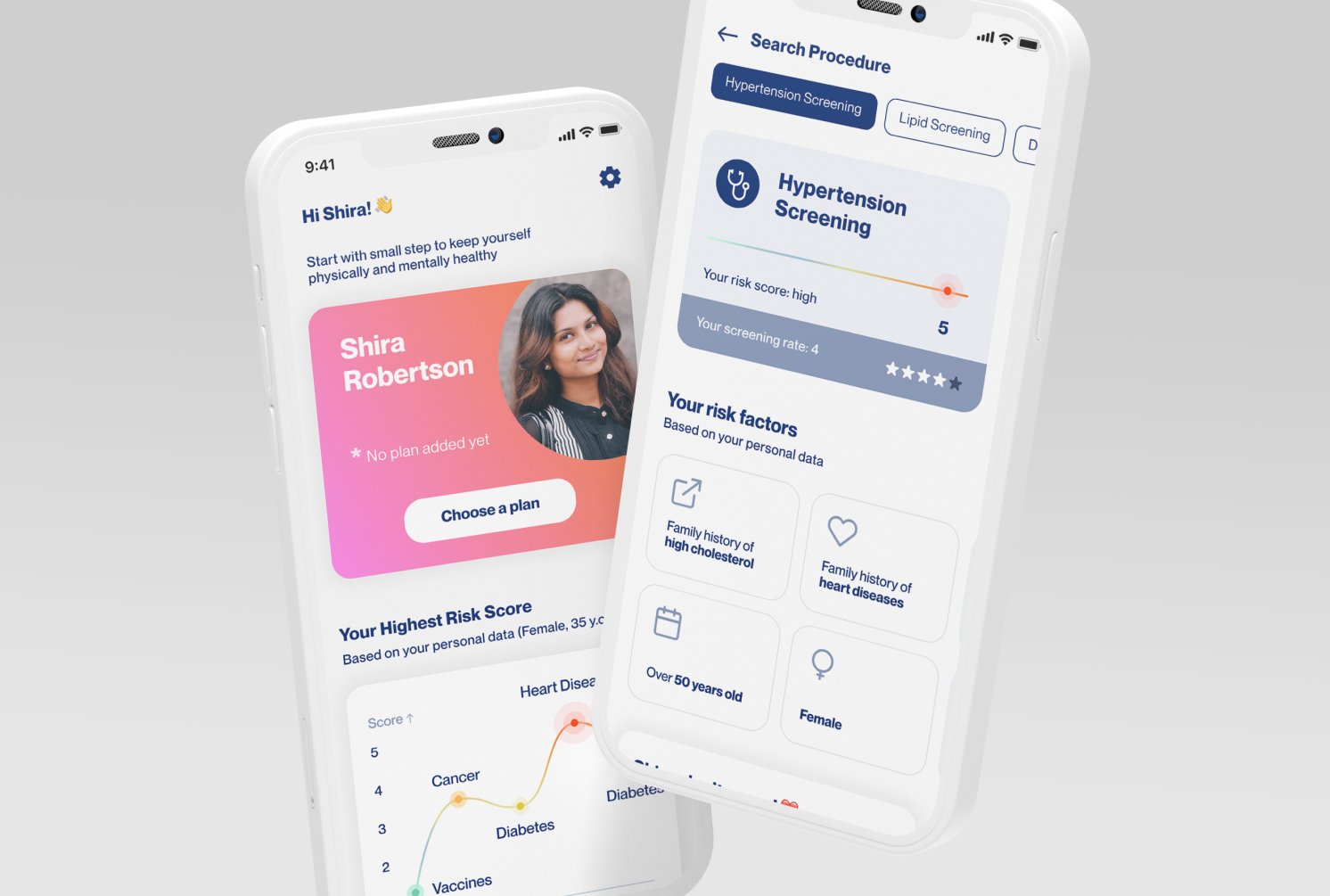
Icons are not enough for describing an important procedure details
🔺 Legibility
Page description’s kerning worsens readability
🔺 Accessibility
Boarder line of finger-friendliness (cards and some other clickable elements)
the smallest font on card description on the screen is not legible enough
🔺 Color palette
Depressing, settled colors
icon disharmony
🔺 Attitude
‘Don’t worry’ message is much more important, should be highlighted as a disclaimer or similar
Profile picture on the right top corner is nice, but the page could be more personalized visually
Each card contains number next to the arrow, and it’s not clear enough what the number means
CTA ‘Take the first step’ in the end of the page is not self-explanatory, doesn’t show the user where he gets after clicking it.
High risk chance should be more highlighted

Additional notes
Consider showing the risk scale before
the list with numbers, so the user would identify it by the color as wellThe whole UI is made for iOS. Not sure which platform the app is made for, but by default I would create for both platforms (at least for the concept)
Design Process and the Final Result
Bright colors, minimalistic look, balanced iconography, clear appearance, and a lot of white space are applied for better information scanning. I used the Atomic Design approach to structure elements and kept the new UI design consistent and pleasant to the user’s eye.

New Structure: Organisms example tile
Things Added and Edited
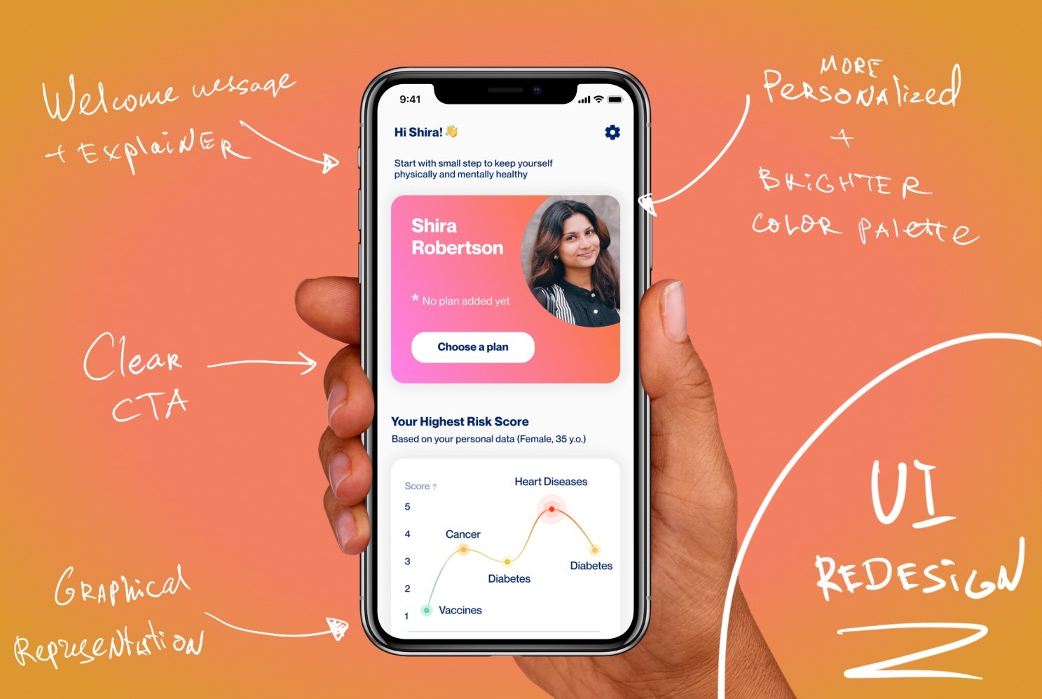
Personalization: welcome message, card view with clear CTA, ‘Don’t worry’ message highlighted and placed after the relevant information
Improved readability and legibility of all text blocks
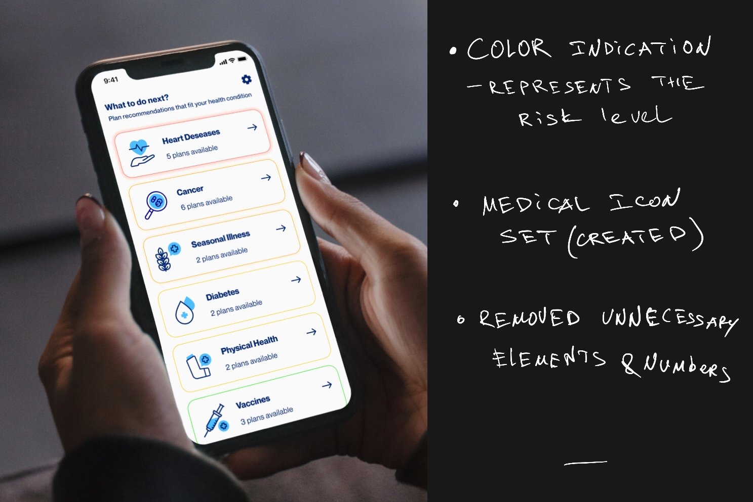
Color palette: brighter colors, color indications for the risk levels (rainbow-based model where the red is the highest risk chance)
New medical icon set for visual information about each disease
Removed unnecessary elements like dividers and borders, used white space and grouping instead
Rounded corners, friendly icons and language makes the UI much less scary and dangerous
Added graph for the visual representation of the risk changes and the level of need of the procedure
Takeaways
The design process can be continuous, even never-ending. What matters the most is the priority of user needs, the deadline, and the business aspect of the product. This process shows that even in a couple of days, the critical design issues can be solved quickly. And if the chosen approach is a good fit for the specific project, the successful result will be even scalable enough to develop the solution in the nearest sprint.
Thank you for reading this through. Feel free to request a design mentorship session with me on ADPlist, and explore more of my working process and stay in touch on social media platforms like LinkedIn, Instagram.