Redesigning Trust: How Adding Steps Increased Loan Approvals by 21% 🛫
The Impact
I redesigned Abound's loan application experience, challenging the industry assumption that "fewer clicks = better UX." By breaking a dense 3-screen flow into 10+ micro-steps, we reduced cognitive overwhelm and increased trust in a high-stakes financial decision.
Results
21% increase in loan approvals
2x more users completing to "pending approval" stage
Dropout rate decreased from 68% to 34% at identity verification
Average completion time: 8 mins (vs. 12 mins in old flow despite more steps)
My Role
Lead Product Designer (contract), working directly with founders, PM, and engineering team. Responsible for UX strategy, full application redesign, design system, and QA through launch.
Timeline: 4 months (Discovery → Launch)
You can also view this presentation in Figma Slides 🔗
The problem
Trust in a Predatory Industry.
Abound's mission is offering affordable loans to underserved communities. But they faced a UX problem: users started applications and never finished them.
Initial hypothesis from the client
"The flow is too long. We need to cut steps."
What I discovered through research
Users weren't dropping off because of length, they were dropping off because of overwhelm
Asking for SSN, bank details, and ID verification on one screen felt invasive and sketchy
Users had PTSD from predatory payday loan services (think: hidden fees, aggressive collections)
No clear progress indication: users didn't know how much more they had to share
The Insight
Progressive Disclosure Builds Trust
I proposed something counterintuitive: make the flow longer, but each step simpler.
The strategy
One question at a time: reduce cognitive load per screen
Explain before asking: tell users why we need each piece of info
Show progress constantly: users need to see the finish line
Celebrate micro-completions: positive reinforcement at each step
This meant: Going from 3 screens → 10+ screens, but each screen felt easier to complete.
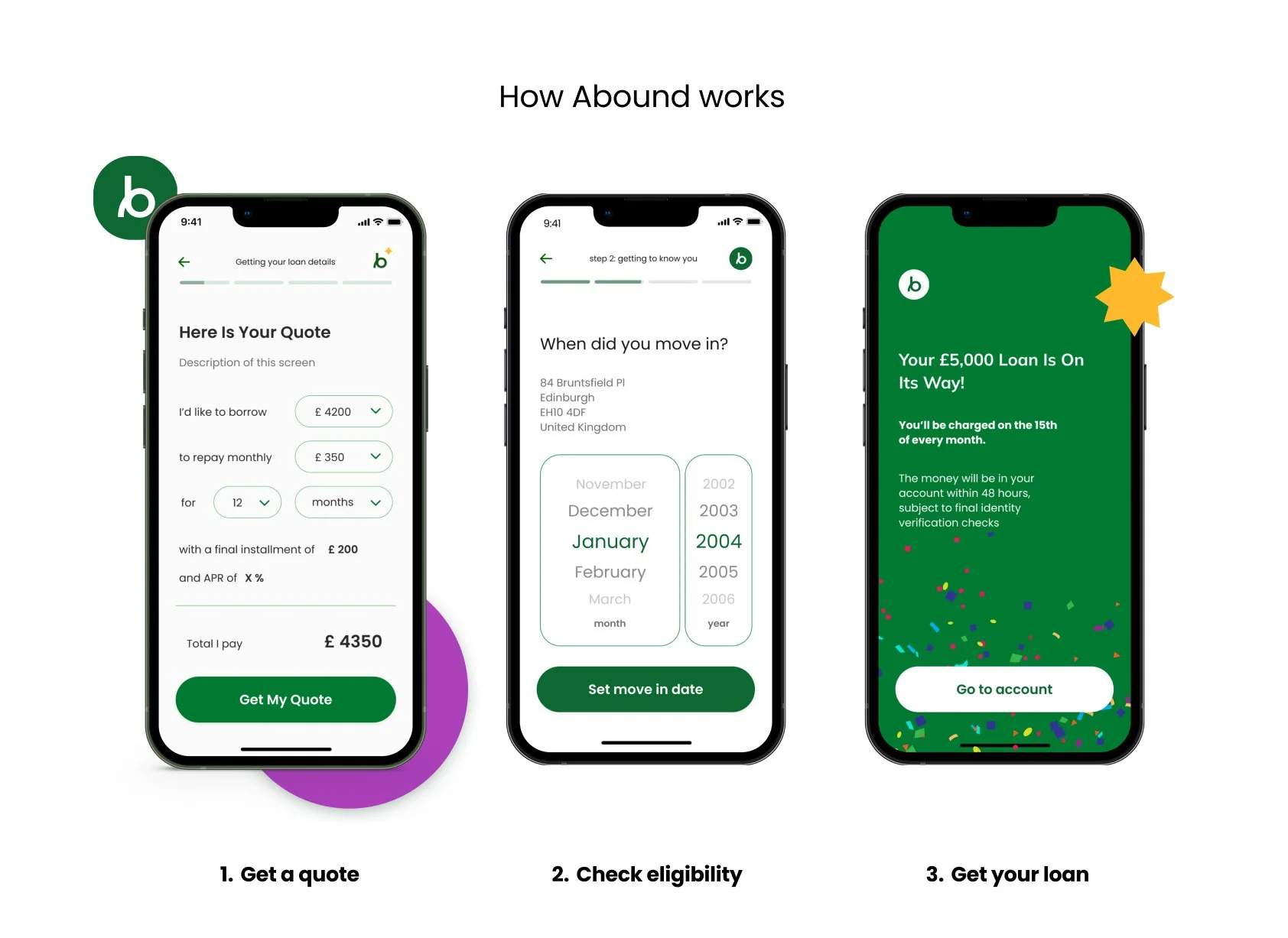
Final product design, mobile screens
Research & Validation
Methods
8 user interviews with target demographic (subprime credit, first-time loan applicants)
Usability testing on Figma prototypes (5 rounds)
Analytics audit of existing flow (identified exact dropout points)
Competitive analysis of fintech onboarding (Chime, Dave, Cash App)
Key finding from analytics
68% of users dropped off at the "identity verification" screen
Average time-on-screen: 4+ minutes (users were hesitating, not completing)
Dropout spiked on mobile (89% of traffic)
Hypothesis
Users needed reassurance that their data was being used securely, not just collected in bulk.

You can also view this presentation in Figma Slides 🔗
Design Decisions & Rationale
1. Progressive Information Architecture
Before: One screen with 8 fields (name, DOB, SSN, address, phone, email, income, employer)
After: 8 separate screens, each with context
Screen 1: "Let's start with your name" (low stakes, easy)
Screen 2: "When were you born?" (still comfortable)
Screen 3: "We need your SSN to check eligibility—this is secure and won't affect your credit score" (explain the scary stuff)
Why this worked
Each small win built momentum. Completion felt achievable.
Trade-off
More engineering complexity (state management across steps). Worked with dev team to build a robust session system with auto-save.

2. Transparent Progress Indication
Added a persistent progress bar that showed:
Current step number
Total steps remaining
Phase of journey (Pre-approval vs. Identity Verification vs. Setup)
Why: Users needed to know they were making progress toward a goal, not stuck in an endless loop.
Design challenge
How to show progress without intimidating users with "12 steps remaining"?
Solution
Grouped steps into 3 phases with visual indicators. Progress bar showed phase completion, not total step count.
3. Identity Verification Redesign
This was the highest dropout point. Old flow: Upload ID photo → take selfie → wait.
Problems identified
Users didn't understand why they needed to upload ID and take a selfie
No feedback if photo quality was poor → rejections felt arbitrary
Waiting period felt like a black hole (no communication)
New approach
Step 1: Explain what's happening ("We verify identities to protect you from fraud")
Step 2: Guide photo capture with real-time feedback ("Move closer," "Hold steady")
Step 3: Confirm upload succeeded with clear next steps
Step 4: Set expectations ("Verification takes 1-2 business days. We'll email you.")
Result
Dropout at this stage went from 68% → 34%.
Navigating Constraints
Stakeholder Pushback: "Too Many Screens"
The founders were skeptical—industry standard was 3-5 screens, I was proposing 10+. I built two prototypes and ran moderated usability tests. Users completed the longer flow faster and with more confidence. Data won the argument.
Technical Constraints
Engineering worried that more screens meant slower load times on mobile. We implemented aggressive pre-loading and optimistic UI (show next screen while data saves in background). Users never noticed the complexity.
Branding Conflict
A branding agency wanted minimal geometric visuals. I advocated for warmer, human-centered illustrations to reduce anxiety during high-stakes moments. We compromised—kept their shapes but added softer colors and micro-interactions.

Outcomes & Learnings
Beyond the metrics, this project taught me:
1. Shorter isn't always better. The "reduce clicks" mantra is oversimplified. What matters is cognitive load per step, not total steps.
2. Trust is built through transparency. Every time we explained why we needed information, completion rates increased. Users don't mind sharing data—they mind not understanding why.
3. Design for the emotional journey, not just the task. Applying for a loan is stressful. Reducing anxiety was as important as optimizing the UI.


Thank you for reading this through. Feel free to request a design mentorship session with me for no cost on ADPlist, explore more of my career, and/or get in touch on LinkedIn.