Custom illustrations for coffee shop mobile app ✍️

In the following case study, I describe an unusual project for my practice: creating product illustrations for the mobile app. Thanks to the client and the Great PM (Martin Strutz) from my beloved a.team, this happened to be a fantastic experience. After which, I’ve started to work as an illustrator and not just a product designer.
About the Client & Deliverables

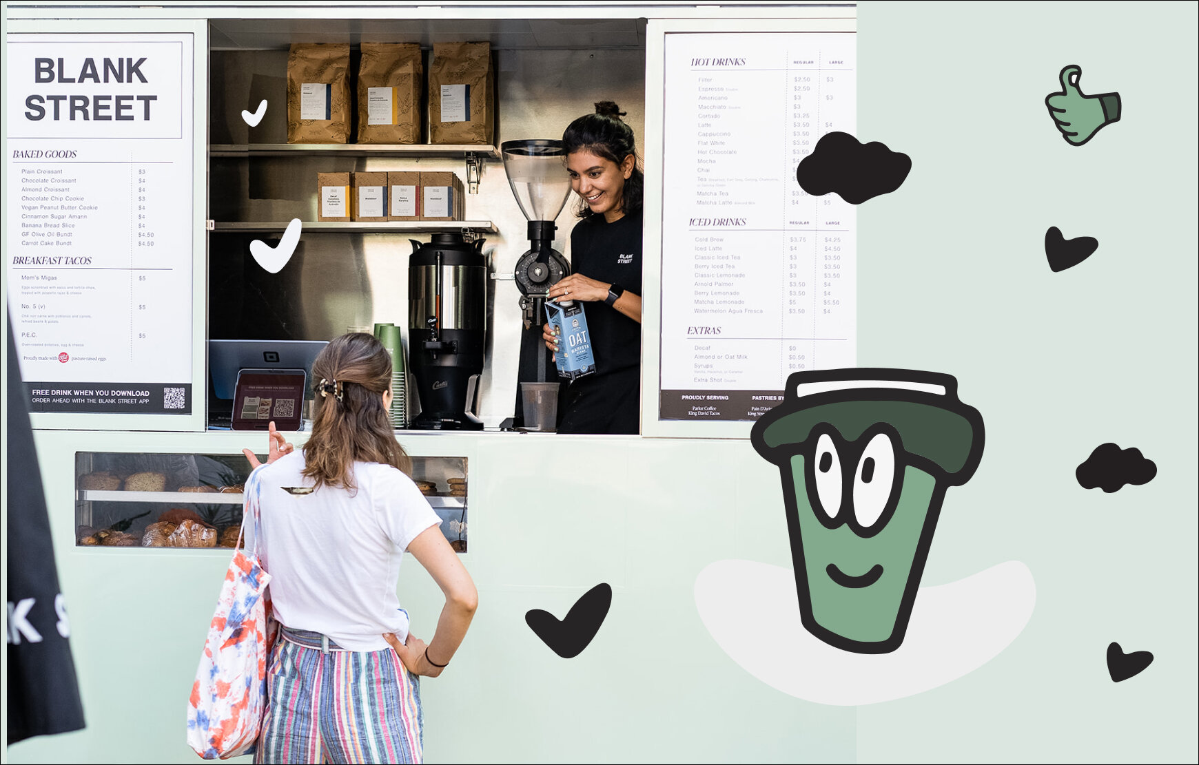
WHO ARE BLANK STREET?
Blank Street is re-imagining the coffee shop, by putting it in your hand and on every corner.
They serve you fro zero-emission coffee carts, integrated with order-ahead app, so almost nothing stands between you and your cup.
Find out more on blankstreet.com
The Task
To create illustrations for the Blank Street App, which will emphasize the celebration moments, warnings, notifications, and other situations while a user is interacting with an app and orders coffee.
What’s been done:
Brand Analysis
Style Exploration & Association map
3 directions of the style suggestions
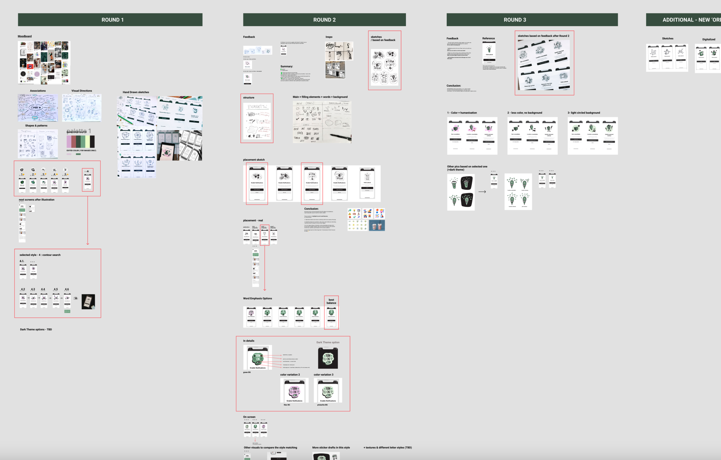
100+ sketches
Set of 20+ illustrations for light and dark themes
Component library in Figma

5 out of 20 final illustrations (for light mode)
The Process (Briefly)
Even though I’m an artist by degree, I think this was the most creative process of all time I’ve been working as a designer. We’ve started with the style search. The client had a mood board, but after some discussions, I came up with my own one, which we agreed on. After a couple of iterations, we found a style, created the pilot (the most complex pictures), and developed the whole series. In the end, the dark theme was taken into account. This was the story in short! Scroll down for more details.

First concept sketches
Step 1: Getting Inspiration

Brand mood board given by the client
So, what do we want these images to feel like?
The coffee shop branding is very minimalistic and beautiful, we wanted to highlight it but give a human touch to the icons of empty states and messages. Imagine you are talking to an intelligent barista with a good sense of humor.

The mood board I created based on the references and discussions
Step 2: Association Map & Paths
To solve the big thing, you better break it into a few small ones. This is what I did for BS. First, I created an association map and wrote down everything that reminds me of a coffee shop. Everything that repeats might be the most relevant. Well, in theory! Ideally, you must select the best out of everything but avoid the most boring options or cliches.

Based on the highlighted ones (the most frequently mentioned), I’ve decided to map out 3 main directions for the future and discuss them with a client. To make sure we are speaking the same language.
Three main directions:
1) No character-like, realistic images but sketchy
2) Abstract shape-based blobs, bubble style
3) Friendly face which appears on the things or surfaces

directions for the first discovery
Step 3: More sketching & Ideation
In the second round, I’ve got some more references from the client. Eventually, we followed the ‘less is more’ rule, which meant fewer colors from the palette and more dynamics in the drawings.

Tools Used
Most final sketches were done digitally on iPad, but I love to work with pen and paper first as an old schooler.
However, it takes time to iterate the hand drawing on different surfaces. It gives an uncountable amount of options to explore when you are transitioning from analog to digital. There are some downsides as well, for sure! For instance, the feeling of the hand decreases significantly. Our goal was to save as much of it as possible.

The first round of sketches with its possible outcome reactions, style search of detailing level
I tried to explain my thoughts without words since we were communicating with PM mostly in Figma. But the given feedback was so intelligible and straightforward, so my perfectionist just felt like the luckiest person in the world.
In my turn, I structured the process pretty clear as well: I documented everything we’ve discussed with PM. So you could go back any minute and compare it to the previous option. Art (and the client) is very subjective and dependent. Having another option in mind is always a grid idea.
1 out of 5 pages in Figma file: rounds, feedback, sketches… All is transparent and structured
Step 4: The Fun Part
Even when we agreed on the direction, I didn’t give up exploration. Now it was easier to concentrate on the style, but it still was a lot to offer as additional ideas. So I decided to explore the detailing level, but trying a few new things was also really tempting. Even though the client wasn’t expecting it, I suggested a sticker set and the illustration sketches based on these stickers. Eventually, we found the best, the 4th direction as a final one, but probably it turned out that way thanks to this additional effort I’ve made. This last style was both sloppy and friendly.

Pen&papre sketch VS digitalized version of it

Additional option: sticker-like style of images and characters
Final Deliverables
From the kick-off call to the final file delivery, the whole process took around two weeks with all the edits, breaks, and follow-ups. I wasn’t working full time, but the creative process is not linear, so it always makes sense to add a few extra days to the deadline to be on the safe side.
The Dark Mode magic
I'm not a big fan of dark interfaces (even though my website has a dark background everywhere), but I should be following the rules provided by the world's lead brands and companies, such as Apple's guidelines and Human-Centered design principles. Moreover, it's always nice to have an option to switch to the dark mode, so Included in the pack is the set of the same illustrations for dark mode.
At the end of the process, I had:
Figma file structured well (with all the sketches and iterations documented)
20+ illustrations for each mode (dark and light)
The style guide for additional pictures that might be needed in the future

The Challenges and Takeaways
Even though I graduated from university as a book illustrator, I’ve never worked as a solo artist. But being a product designer teaches you to follow perfection and pay attention to the tiniest details, so this project was at the same time challenging and exciting.
The team wasn’t big: just the client, the PM, and me, and this is the best case that could ever happen when the task is about creativity and art. In two weeks, we created so many sketches and discovered so many styles, so I felt inspired and ready to be an illustrator straight away.
If I would do that again, I’d probably choose another style and technique, but the client was happy, and this is the best ending of the collaboration for me.

They All around NY
Unfortunately, I haven’t tried the coffee yet, but I’m sure it’s the tastiest thing in New York. Make sure you try it while visiting!